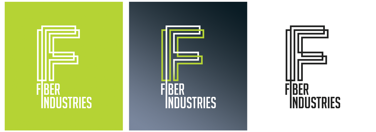
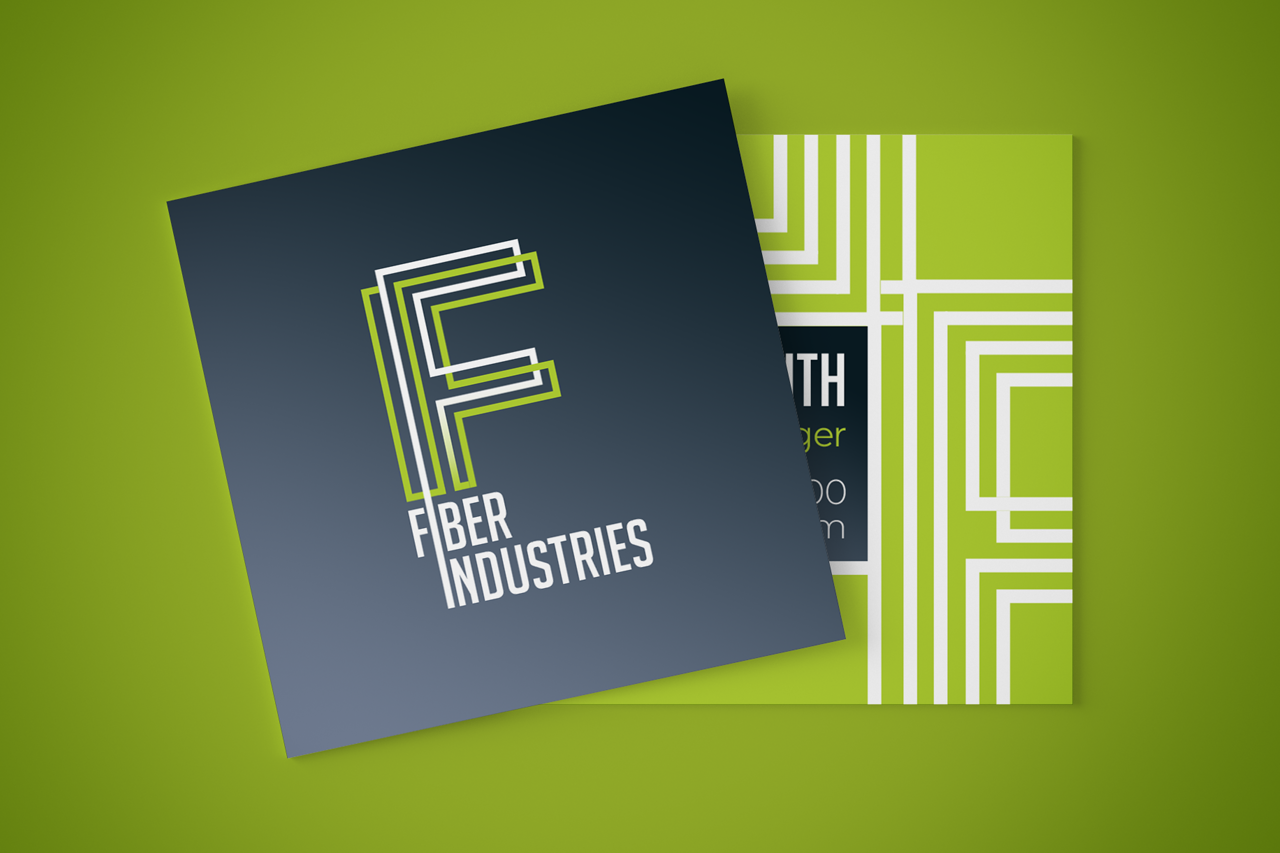

For Fiber Industries, we wanted to create an identity that felt modern, technical, and built for a company with real manufacturing experience behind it. The goal was not to make the brand feel overly decorative, but to give it a strong, purposeful mark that could represent precision, process, and forward movement. The logo mark is built from layered linear forms that come together to create a stylized “F.” This approach was chosen to visually connect back to the company’s core product: fiber. The repeated lines suggest strands, production paths, and the structured systems behind industrial manufacturing. By keeping the mark geometric and simplified, the logo feels clean and recognizable while still carrying a subtle connection to what the company actually does. The color palette was also selected with intention. The deep charcoal gives the brand a grounded, professional, industrial base, while the bright green adds energy, growth, and a more progressive tone. That contrast helps the identity feel established but not outdated. It supports the idea of a company with history and capability, now moving forward with renewed focus, modern technology, and a stronger presence in domestic manufacturing. Overall, the identity was designed to feel confident, efficient, and direct. Every element was kept clean and structured so the brand could work across signage, printed materials, digital applications, packaging, and corporate communications. The result is a visual system that positions Fiber Industries as a reliable American manufacturer with a sharp, modern, and future-focused brand presence.