

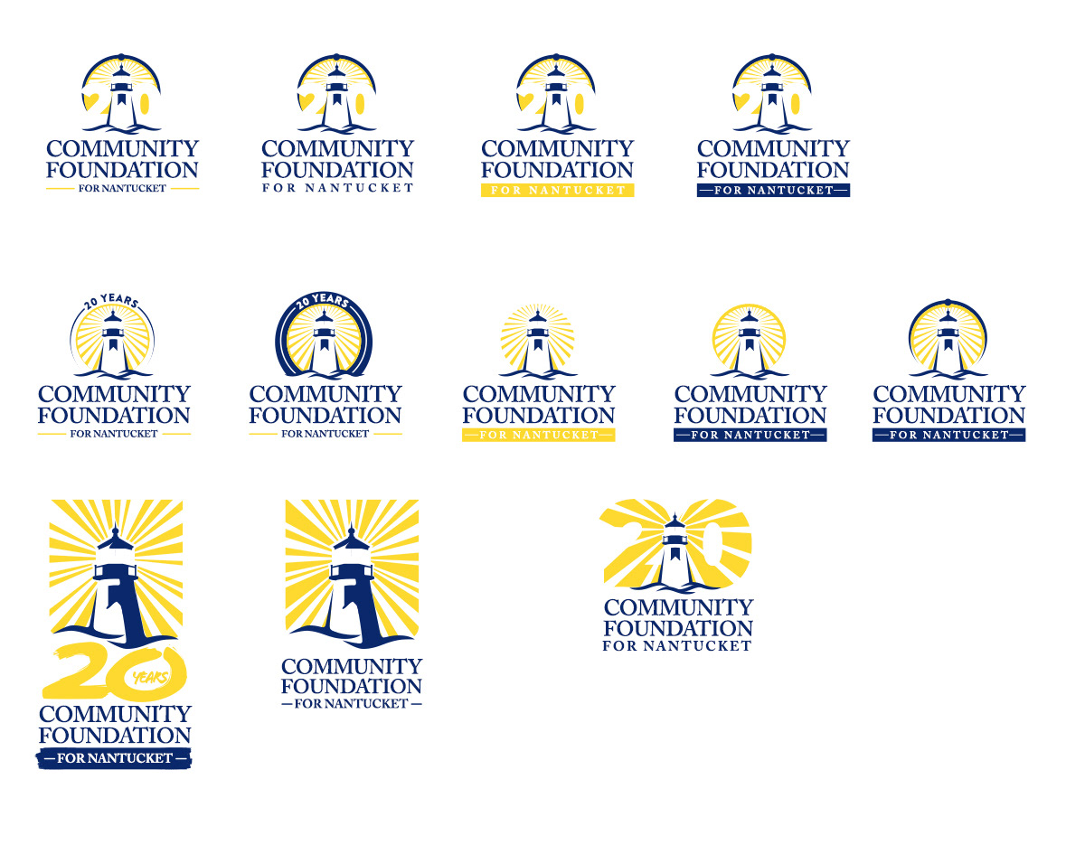
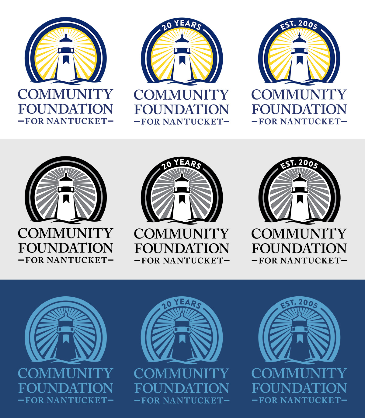


The client wanted a complete redesign of their existing logo to create a fresh, modern visual identity that better represents their brand's current image and goals. The current logo feels dated, with heavy sun rays, a font that looks outdated due to the use of large title casing, and a flat, static design featuring wood cuts and a ground extending to the sides. To breathe new life into the logo, the lighthouse was updated to feel more contemporary, the weight of the rays were lightened, a splash of color was added, and the overall design was simplified with a tighter lock-up for a cleaner, more cohesive look that aligns with the client's brand.